
- Optimised web design: make browsing a breeze
- Speed demons: fast loading times to turn clicks into cash
- Mobile mastery: optimising for on-the-go shoppers
- Boost your average order value: easy wins for bigger profits
- The art of the checkout: simple steps to more sales
- Sell more with smart strategies: upselling and cross-selling
- Conversion magic: turning visitors into buyers
User-friendly navigation to boost your shoppers’ baskets
Simple, intuitive website navigation is an essential part of any successful website, regardless of its products or services. Ultimately, your site needs to be accessible to your users. Website navigation tools act like a map, allowing visitors to easily move around your website to find what they need.
If a customer is struggling to navigate through your website, they may become frustrated and leave. By improving navigation, you can combat this issue and create a more positive user experience. In turn, this can help to improve conversion rates, sales and revenue for your business.
Ecommerce expertise to turn browsers into buyers
Website menus
Website menus are the bread and butter of easy website navigation. They are typically positioned down the side or along the top of a page and provide links to the different areas of your website. Some can also be expanded to display pages nested inside primary website areas. These can be ‘sticky’ menus, meaning they follow the user as they scroll down the page, or fixed to the header.
Footers
Providing footers at the bottom of each of your pages can be a valuable addition to your website. When a user reaches the bottom of a page, it can be useful to guide them to other pages to increase engagement and encourage them to make a purchase. Include links to your popular pages or other relevant pages that your customer may be interested in within the footer, to encourage them to spend more time on your site.
Breadcrumbs
Breadcrumbs show a visitor how the page they are viewing is nested inside other pages, so they can easily navigate to parent pages or other relevant pages to find the information they need. This also helps users to orientate themselves on your website, which can reduce navigation frustrations.
'Next' buttons
Sometimes a user may have finished reading or interacting with one of your pages, but not know where to go next. Adding ‘next’ buttons to sequential pages on your site can direct users and improve user engagement.
Mobile navigation
Most mobile sites feature ‘hamburger’ menu bars. These are collapsible menus that streamline mobile sites by removing clunky fixed navigation menus that take up valuable space. These menus can be easily expanded when the user wishes to navigate to a new page.
How to investigate user navigation
Before you get started changing your website navigation, you need to understand how visitors are currently using your site to ensure you’re making effective changes. To understand your user behaviour on your site, you could use the following tools.
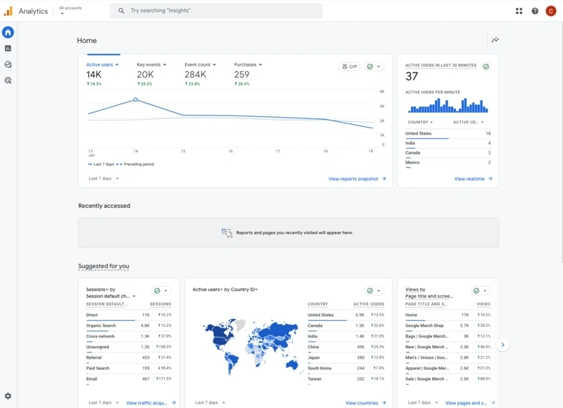
Google Analytics Visitor Flow
This feature in Google Analytics allows you to see the path that your users follow on your site. This can help to identify any areas where users typically get stuck or leave your site.
Conversion-assist reports
These reports are often found in marketing software such as HubSpot, and work by tracking the path of customers who typically make purchases on your site to identify popular pages. Identifying these pages can help you to understand which pages are accessible and which may need better navigation.
“By analysing customers’ spending and behavioural patterns, you can build on the information you’ve gathered from your loyalty programme subscriber lists and target customer segments.”
Peter Charmant, Head of Corporate Retail (Pan-EU and Ireland), Elavon Europe
Mobile accounts for approximately half of web traffic worldwide. In the last quarter of 2023, mobile devices (excluding tablets) generated 59% of global website traffic. Mobiles and smartphones consistently hovered around the 50% mark since the beginning of 2017, before surpassing it in 2020.
The importance of good product photos for ecommerce
Product photography is vital for any ecommerce business. As your customers can’t physically see or feel your products, your product images need to do the selling for you. Providing professional product imagery can also increase engagement with your website and build customer trust in your brand.
Producing high-quality product photographs doesn’t have to be expensive. Discover our useful guide for ecommerce businesses, so you can start creating professional product photographs that make your products stand out.
Approximately one minute of video is worth 1.8 million words. Websites see better engagement with video. A study found that the average user spends 88% more time on a website if it has video.
Taking and editing product photography
The quality and professionalism of product photographs can directly affect your brand image and trustworthiness, influencing potential sales.
Creating high-quality product images does not always require a professional photographer or studio. To get started taking great photos of your products, all you need is a camera, a tripod and a lightbox. Some products, such as food, people and clothes also often photograph better in natural light, making professional product photography even more accessible.

Taking time to consider an appropriate name for your product images can be beneficial for your website’s search engine rankings. Ranking higher in search-engine results pages is essential for reaching a wider potential customer base.
Once you’ve created and edited your product photographs, add ‘alt text’ to your images to help search engines to understand what your image is showing. Optimising your image’s alt text with keywords and providing an accurate description can demonstrate to search engines your website’s relevance to a user’s search terms. This process is relatively simple and can ensure that your carefully crafted photographs are displayed to potential customers.
What makes a good product page design?
For anyone who is just about to set up an ecommerce website, or already has one, the first thing to get right is the homepage. The homepage is the first thing your customers see when they arrive on your site, so it needs to be right.
The main objective for any ecommerce website is sales, so a product page needs to be designed well enough to show your visitors exactly what you’re selling and that it’s something they absolutely can’t live without.
With around 70% of online shopping carts being left abandoned, your product page is a vital part of your website to improve your ecommerce conversion rates. Essentially, your product pages should clearly tell your customers:
What your product is
The needs your product fulfils or problem it solves
The details a customer needs to see to decide whether to buy or not.
Here we’ll look at the following to help you increase your sales and revenue by improving your product pages:
Product page: the basics
Images and product descriptions
Persuading customers
Product page layout
The average 70% cart abandonment rate means that only three out of ten customers who fill their shopping carts make it to checkout to complete their purchase.
Before you begin – product page basics
As already mentioned, when a customer reaches your product pages, they should be presented with the right amount of information to help and convince them to buy what’s in front of them. The main aim is for your product page to make the process as instinctive and simple as possible. So where do you begin with this? Ideally, you should make sure it focuses on the following:

Images and product descriptions
A strong image can speak a thousand words. Images communicate thought and emotion, whilst communicating your narrative in a way words alone can sometimes lack.
93% of consumers consider visual appearance to be the key deciding factor in their purchasing decision.
Therefore, selecting which images to include and where and how they sit on a product page is vital. Your products are unique and you need to showcase them in such a way that will encourage customers to spend money on them.
Product descriptions
Product descriptions help prop up your product photos, giving your customer everything they need to understand what it is and why they should buy it. Your customer isn’t browsing in-store with the ability to touch and feel your product. This means your product descriptions must be persuasive to sell the product.
“Product description really speaks to the quality of your ecommerce product, whether that’s a website, app or other channel. Make sure your descriptions are fair and accurate, but also to the point.”
James King, Head of Professional Services, Elavon Europe
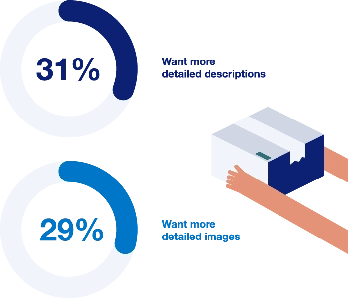
Elavon research shows the importance of the design and writing on your website. Almost a third (31%) of shoppers said more detailed descriptions would encourage them to shop online, and more than a quarter (29%) said better images would motivate them to shop online.
Here we’ll look at the following to help you increase your sales and revenue by improving your product pages:
Product page: the basics
Images and product descriptions
Persuading customers
Product page layout
The copy sitting next to the main product image (above the fold) need not contain fluffy words. It should be short, snappy and to the point. A slightly longer, more detailed description of the product should then be placed further down the page.
Be clear, simple and informative.
Include clear pricing
Avoid long sentences and jargon
Avoid using clichés or empty claims
Be persuasve. Excite your customers
Stick to your brand's tone of voice
Persuading customers
So, how do you persuade your customers to buy your product?
This is where social proof comes in. Social proof is the idea that consumers will adapt their behaviour according to what other people are doing. Or in this case, buy something because they see others doing so. This is why customer reviews and ratings are so important.
According to a study, 93% of consumers say online reviews impact their purchasing decisions.
So, it’s vital to have some form of social proof at the top of your product page making it instantly visible to shoppers. The best way to do this is to show the product’s star rating near the product title. Customer reviews should then be included further down the page so that people can see what other shoppers have thought about the product. For example: sites like Amazon and Etsy place star ratings and customer reviews prominently on their product pages.
Social proof adds credibility and can significantly help to boost sales. Reviews, testimonials and images from Instagram (from both customers and influencers) all help provide a vote of confidence in the value of the product. Additionally, any press coverage your brand receives is a great way to build brand awareness and highlights that your brand is worth paying attention to.

- Update your product descriptions based on customer reviews
- Add social sharing buttons to product pages
- Show the logos of publications and websites your products have been featured in
- Ask your customers for a testimonial as to why they chose a particular Product
- Product reviews and customer testimonials should certainly be thought about when designing the page layout. Most reviews sit below the fold but it’s common practice to put the best reviews in the product description area
- Show an average star rating of all reviews beneath the product title.
Product page layout
For an online store, the layout and design of a product page are important to get right. The design should pull together the product photos, pricing and descriptions whilst avoiding clutter in order to guarantee a sale.
There are various styles you could opt for depending on the type of product, but the three most prominent are:
Essentials for good page design
Fundamentally, when designing the layout of the product page (whichever one you choose from the above) you should make sure you include a strong CTA button, good user experience (UX) features to make it easier for the customer to make a purchase, highlight product recommendations and build customer confidence throughout.
When it comes to your product page layout your ‘add to cart’ or ‘buy’ button should not be drowned out by product descriptions or reviews. Your CTA button is one of the most important elements of your page alongside images, so make sure they’re in a place the customer cannot miss (but without being too garish).
Essentially, you should be making the buying process easier for your customers, for them to convert. For mobile devices, the CTA should be the width of the full-page to enable customers to tap with either thumb.
Mobile users have the highest cart abandonment rate, with 86% of shoppers failing to make it to checkout. However, unlike traffic from tablet devices, which make up a tiny percentage of ecommerce sessions, mobile traffic accounts for more than two-thirds of all ecommerce sessions at 68%.
For example, a CTA button could feature in a different, bright colour to stand out from the other text and sit above the fold to assist with the customer journey.
UX features such as overlays or pop-over boxes, drop-down tabs, and content that reveals when you hover over, are all important to include when considering the product page design and layout. These features will ensure that users who want to read more details can easily find that information, without overwhelming or crowding the page.
When laying out your product pages, it’s worth considering product recommendations to potentially secure another purchase. Product recommendations suggest alternative products a buyer may like based on their viewing history or the page they’re on. Amazon is great at cross-selling with product recommendations, especially their ‘recommended for you’ carousels. You may also see on other sites:
- ‘Customers also bought’ lists
- 'Similar items’ suggestions
- ‘Top picks for you’ recommendations
Personalised product recommendations drive revenue. Visits where a shopper clicked a recommendation comprise just 7% of all visits, but 24% of orders and 26% of revenue.
Build customer confidence
Communicating the quality and sizing of a particular product,
as well as return policies and customer service commitments, are all important elements to consider when laying out your product pages so your visitor feels comfortable buying from you and trusts you.
When we questioned more than 1,000 adults across Ireland, almost two thirds (63%) of those who answered said that free returns, labels and packaging would encourage them to shop online. A similar proportion (59%) said reliable delivery was a key reason to encourage shopping online.
Respondents were also keen for same-day delivery (42%), returns collected from their house (40%) and a wider range of delivery slots (20%).

“This really underlines how important it is for you, as an ecommerce business, to develop an excellent relationship with a delivery firm.
We also see younger shoppers keen for same-day delivery, while a sizeable minority of all shoppers also like that availability. Something to consider, to help you compete with the high street or an edge over your competitors.”
James King, Head of Professional Services, Elavon Europe
Your product pages are the lifeline of your online store. If they aren’t presented well, you run the risk of losing a customer and a sale. Creating stand-out product pages will ensure you see customers returning, they’ll help with your store’s brand and reputation, and set you apart from your competition.
Use high-quality images
Include simple informative product descriptions
Use persuasive calls-to-action
Use social proof to back up your products
Use product recommendations
The purpose of an effective product page is to persuade customers to buy from you. When it comes to making decisions on the layout, copy and design of your product pages, be sure to keep the customer at the forefront of your mind.
On this page
- User-friendly navigation to boost your shoppers’ baskets
- How to investigate user navigation
- Tips and tricks for easy website navigation
- The importance of good product photos for ecommerce
- Types of ecommerce product photos
- Taking and editing product photography
- Retouching
- Linking optimisation of product pictures to SEO
- What makes a good product page design?
- Before you begin – product page basics
- Your copy should
- When creating your product pages, be sure to
- Product page layout
- Essentials for good page design
- Build customer confidence
- Recap of product-page features


Helping thousands of customers around the world grow their business through payments
Customer service and support
We’re here to help!
Customer service: 0345 850 0195 (menu option 2)
Telephone: Monday to Friday, 8am to 5pm
Chat: Monday to Friday, 8am to 6pm
Elavon technical support: 0818 20 21 30 (menu option 1)
24 hours a day, 365 days a year
Opayo product support: 0191 313 0299
24 hours a day, 365 days a year
Copyright © 2026 | U.S. Bank Europe DAC. Registered in Ireland with Companies Registration Office. The liability of the member is limited. United Kingdom branch registered in England and Wales under the number BR022122.
U.S. Bank Europe DAC, trading as Elavon Merchant Services, is a credit institution authorised and regulated by the Central Bank of Ireland. Authorised by the Prudential Regulation Authority. Subject to regulation by the Financial Conduct Authority and limited regulation by the Prudential Regulation Authority. Details about the extent of our regulation by the Prudential Regulation Authority are available from us on request.
Helping thousands of customers around the world grow their business through payments
Customer service and support
We’re here to help!
Customer service: 0345 850 0195 (menu option 2)
Telephone: Monday to Friday, 8am to 5pm
Chat: Monday to Friday, 8am to 6pm
Elavon technical support: 0818 20 21 30 (menu option 1)
24 hours a day, 365 days a year
Opayo product support: 0191 313 0299
24 hours a day, 365 days a year


Copyright © 2026 | U.S. Bank Europe DAC. Registered in Ireland with Companies Registration Office. The liability of the member is limited. United Kingdom branch registered in England and Wales under the number BR022122.
U.S. Bank Europe DAC, trading as Elavon Merchant Services, is a credit institution authorised and regulated by the Central Bank of Ireland. Authorised by the Prudential Regulation Authority. Subject to regulation by the Financial Conduct Authority and limited regulation by the Prudential Regulation Authority. Details about the extent of our regulation by the Prudential Regulation Authority are available from us on request.
Essential cookies enable core functionality such as page navigation and access to secure areas. The website cannot function properly without these cookies; they can only be disabled by changing your browser preferences. Please see our Cookie Policy for further information.
Performance cookies help us to improve our website by collecting and reporting information on its usage (for example, which of our pages are most frequently visited).
These cookies and similar technologies gather information about your browsing habits. They remember that you've visited a website and share this information with other organisations, such as advertisers and platforms on which we advertise. They do this in order to provide you with advertisements that are more relevant to you and your interests. These cookies and similar technologies gather information about your browsing habits. They remember that you've visited a website and share this information with other organisations, such as advertisers and platforms on which we advertise. They do this in order to provide you with ads that are more relevant to you and your interests.
Find out more about cookies on https://www.allaboutcookies.org